
Components
Alert Banner(Usage)
Important account information displayed at the top of a screen
| Version: | 14.16.0 •View source•Changelog•Report issue | |
|---|---|---|
| Install: | yarn add @thumbtack/thumbprint-react | |
| Import: | import { AlertBanner } from '@thumbtack/thumbprint-react'; | |
Usage
The AlertBanner should be used to notify the user that a product-related signal is of the utmost importance. These messages will thematically provide informational, cautionary, or warning messages based on the severity and importance level determined by the experience.
To re-enforce the level of importance these messages offer, the AlterBanner should be placed at the top of the page, will not be dismissible, and will disappear once the appropriate action is taken.
Best practices
AlertBanner should be used as a banner at the very top of the page.
Call-to-actions (e.g. <a> tags in the children prop) should be the last item in the children.
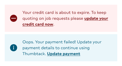
You can use the icon prop to override the default icon.
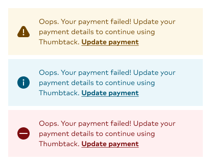
Use icons that appropriately provide the visual accentuation paired with the banner's messaging. Also, it's encouraged to use the filled version of the icon when available.
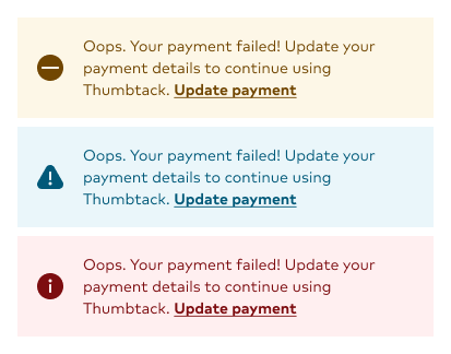
Do not use icons that are defaults for the provided themes. For example, avoid using an info-filled Icon when using the Caution theme.
Place the call-to-action as the last element in the component. These actions are clear, concise, and should follow the principles of Button Copy guidelines.
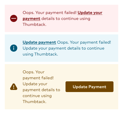
The call-to-action should not appear before the message, be underlined, bold, and should not receive the same as the Button component CTA.